Modern CTN: Building a Site for Serious Buyers
Modern CTN has 200+ construction projects in Azerbaijan. Here's how we built a website that matches that credibility.

Case Study: Modern CTN
Some clients come with a clear problem. Others come with a gap they haven't fully named yet. Modern CTN fell into the second category.
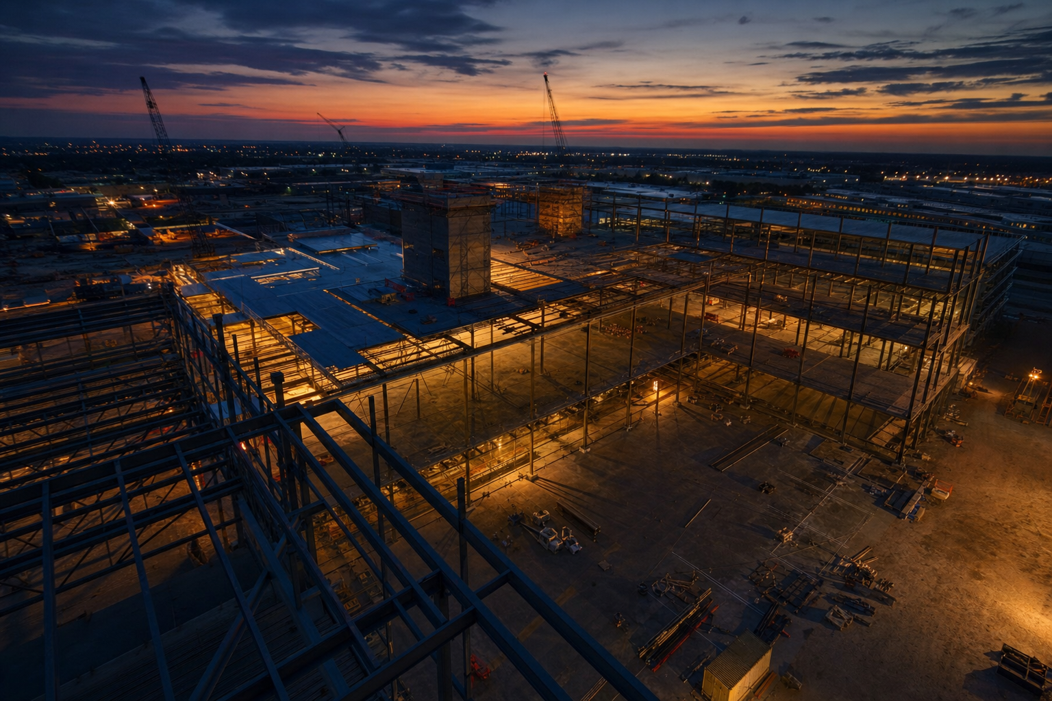
They're a full-cycle construction firm based in Azerbaijan with over 200 completed projects across residential, commercial, and infrastructure work. That's a serious body of work. But their website wasn't carrying that weight. It looked like something built quickly and left alone, which is exactly the wrong signal when your buyers are developers, investors, and procurement leads making six and seven-figure decisions.
The brief was direct: build something that matches who we actually are.
Who Actually Visits a Construction Company's Website
This is the question most agencies skip. They design for a general audience and end up with something that works for nobody in particular.
For Modern CTN, we thought carefully about the actual visitors. They're not homeowners browsing options on a Sunday afternoon. They're project owners, government procurement contacts, real estate developers, and construction managers doing due diligence. These people have seen a lot of construction websites. They know what a placeholder looks like. And they make decisions fast.
That shaped everything about the design direction. Dense credentials, fast clarity, and a visual language that communicates scale without overselling it.
The Portfolio Problem
Having 200+ projects sounds impressive until you realize most sites present that volume as a number and nothing else. A number doesn't close a deal.
We restructured the portfolio section to show range and delivery consistency together. Not just categories, but a sense of the firm's actual operating capacity. What kinds of projects? At what scale? Over what timeline? A sophisticated buyer wants to pattern-match. They're asking, "Have they done something like what I need?" The portfolio had to answer that visually and structurally, not just through a gallery of photos.
Filtering by project type and scale helped buyers self-sort quickly. That's not a small thing. If a visitor has to dig to find relevance, they leave.
Trust Signals in Construction Are Different
In SaaS or e-commerce, social proof often comes from reviews, ratings, or customer logos. Construction doesn't work that way. The buyers are fewer, the deals are larger, and the trust signals are more institutional.
For Modern CTN, that meant foregrounding certifications, years in operation, team depth, and the breadth of services they offer in-house. Full-cycle capability, meaning design through delivery without subcontracting the core work, is a genuine differentiator. We made sure that came through clearly rather than being buried in a services dropdown.
Testimonials existed but weren't the anchor. Credibility in this market is built on demonstrated capacity, not customer quotes.
Writing for the Decision Maker, Not the General Reader
This is where a lot of construction sites fall apart. The copy tries to appeal to everyone and ends up sounding like it was written by a committee.
We wrote the Modern CTN site for the person sitting across from a contract. That means direct language about capability, not vague statements about commitment to quality. It means specific rather than aspirational. "200+ completed projects across residential and commercial sectors" tells you more than "decades of experience delivering excellence."
Every headline was written to earn the next sentence. No filler, no padding. These buyers are busy and slightly skeptical by profession. The copy had to respect that.
Performance on Site, Not Just in the Office
Here's something that often gets ignored in construction website projects: a significant share of visits happen from mobile, often from job sites or client meetings. A site that loads slowly on a phone or breaks on a mid-range Android device is a real problem.
We built with performance as a baseline requirement, not an afterthought. Image optimization, efficient load sequences, and a mobile layout that actually works were all part of the delivery. Not because it's good practice in the abstract, but because the actual users needed it.
What the Final Build Communicates
The Modern CTN site now does what a good construction company website should do: it communicates serious delivery capability without having to argue for it. The visual weight, the structured project history, the clear service offering, and the direct copy all work together.
A visitor who knows the construction industry will recognize it as a credible firm within the first few seconds. A visitor who doesn't know the industry will still read it as established and capable. That's the bar.
The Practical Takeaway
If you're working with a client who has strong delivery credentials but a weak digital presence, the instinct is often to add more content. More pages, more sections, more proof points. Resist that.
The real work is curation and hierarchy. Which signals matter to this specific buyer? What do they need to see first? What can be cut without losing credibility? Answer those questions before you open a design tool, and the build gets a lot cleaner.
Modern CTN didn't need a bigger website. They needed a sharper one.