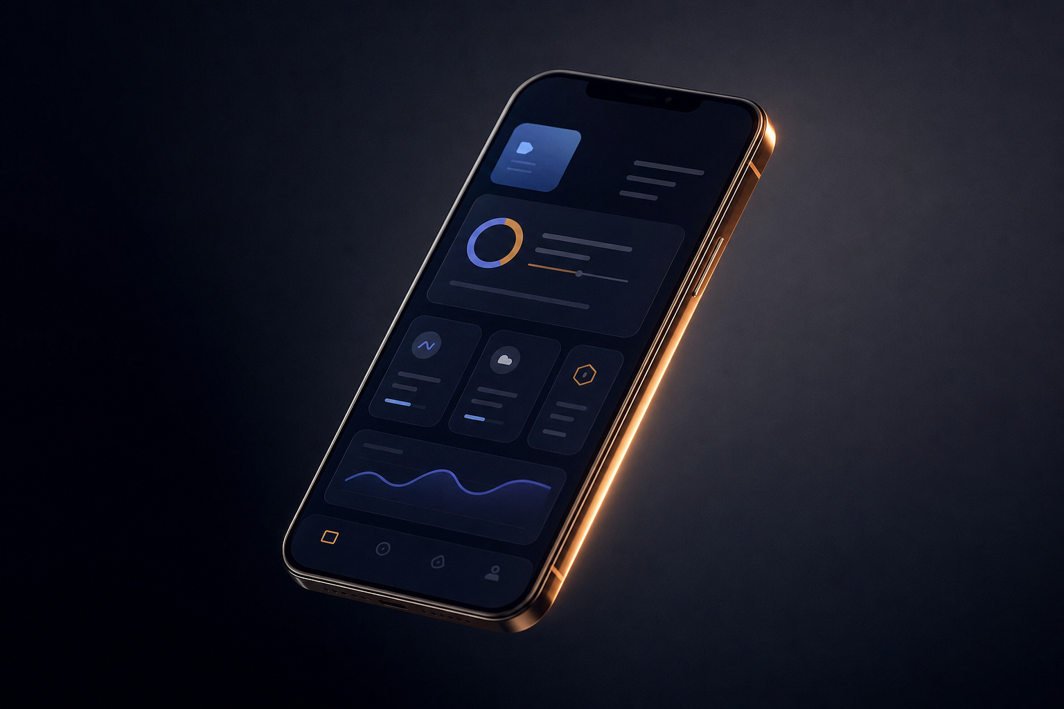
Design as a Conversion Lever: Three Changes, Real Numbers
Most founders treat design as polish. This article walks through three specific UI changes and the conversion numbers that followed each one.

The Founder Who Thought Design Was Done
A SaaS founder we worked with had just shipped a full rebrand. New colors, new typography, new hero section. The team was proud of it. A month later, trial signups were down 12%.
Nothing else had changed. No pricing update. No traffic drop. Just a redesign that looked cleaner and converted worse.
This is not rare. It happens because most founders treat design as a visual decision, something to revisit when the product feels outdated or when a competitor's site makes yours look amateur. The SaaS companies growing fastest right now treat it differently. They treat design as a system of decisions that either move users forward or stop them cold. Every heading, every CTA placement, every form field is either earning its place or creating friction.
Here are three specific changes, with the numbers that followed.
Change 1: Moving the CTA Above the Fold (And Removing the One Below It)
One of our clients, a B2B SaaS platform in the logistics space, had two CTAs on their homepage. One above the fold, one at the bottom of a long feature section. Standard setup. The logic was: give users information first, then ask them to act.
Session replay data told a different story. Seventy-three percent of users who eventually signed up never scrolled past the hero. They arrived, read the headline, and either converted or left. The second CTA was invisible to almost everyone who mattered.
We removed the second CTA entirely and rewrote the above-fold CTA copy from "Get Started" to "See How It Works, Free for 14 Days." Specificity over brevity.
Signup rate increased 19% in the first 30 days.
The lesson is not "put your CTA at the top." Most founders already know that. The lesson is that your analytics are probably not telling you where attention actually lives on the page. Session replay tools, combined with AI-powered friction analysis, are now surfacing hover patterns and scroll depth data that changes which design decisions you even consider making.
Change 2: Cutting a Signup Form From Six Fields to Three
This one sounds obvious. It is not, because the fields being cut are always ones someone on the team fought to keep.
We rebuilt the onboarding flow for a SaaS product in the HR tech space. Their signup form asked for: first name, last name, work email, company name, company size, and phone number. Six fields. The product team wanted all of it for lead scoring.
Form field abandonment data showed 61% of users were dropping off at the "company size" dropdown. Not because they did not know their company size. Because the dropdown interaction on mobile was broken and no one had caught it.
We fixed the mobile bug, removed phone number and company size from signup (moving them to post-onboarding), and collapsed first and last name into a single "full name" field.
Form completions went up 34%. Lead quality, measured by trial-to-paid conversion 30 days later, did not drop. The data the team thought was essential for scoring turned out to be collectible after the user was already inside the product.
The friction was not the number of fields. It was one broken interaction on a device the desktop-focused team never tested on.
Change 3: Replacing a Feature Grid With a Single Outcome Statement
This is the one that gets the most pushback.
A founder will always want to show what the product does. Features, integrations, capabilities. It feels like the responsible thing to put in front of a potential customer. The problem is that a user landing on your site for the first time does not know which features matter to them yet. They are trying to answer one question: will this solve my problem?
We worked with a content SaaS platform, similar in model to RepurposeOne, where we rebuilt the entire above-fold section. The original hero had a headline listing three features and a screenshot of the dashboard. Clean. Professional. And doing almost nothing for conversion.
We replaced it with a single outcome statement written in the language of the user's problem, not the product's capabilities. One headline. One subheading. One CTA. The dashboard screenshot moved to the second section.
Bounce rate dropped 22%. Time-on-page increased by 47 seconds on average. Trial signups rose 28% over the following six weeks.
The feature grid was not wrong. It was just answering the wrong question at the wrong moment.
What This Means for Your Product in 2025
There is a real debate happening right now about whether AI-assisted tools like V0 or Cursor can replace traditional design workflows. Developers can iterate on UI and conversion funnels faster than ever. That speed is real and it matters.
But the three changes above were not discovered through faster iteration. They were discovered by watching where real users stopped, hesitated, and left. That is a research problem before it is a design problem.
AI tooling can accelerate execution. It cannot replace the discipline of asking why a user behaves the way they do before you decide what to change.
The practical takeaway you can act on today: pull your session replay data, or set it up if you have not, and look specifically at form field abandonment and scroll depth on your highest-traffic landing page. You are looking for the moment users stop moving forward. That moment is a design decision waiting to be made.
The best-converting SaaS products are not the prettiest ones. They are the ones that got specific about friction.