Modern CTN: Rebuilding a Construction Website That Wins Commercial Clients
How we redesigned Modern CTN's website to speak to commercial buyers, and what every high-stakes service firm can learn from the process.
The Problem With a Brochure Website
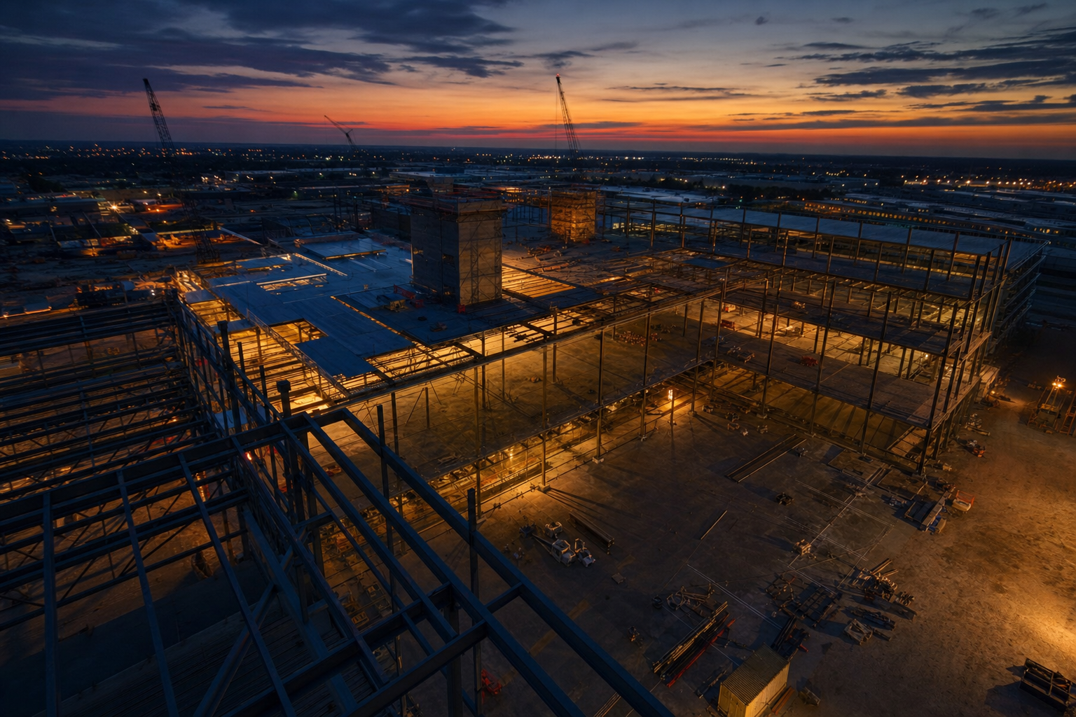
Modern CTN has delivered 200+ construction projects across 15 years. That is a serious track record. General contractors, subcontractors, and commercial developers do not accumulate that kind of history by accident.
But their old website told none of that story well.
It listed services. It had a contact form. It had a few project photos without context. It looked like every other mid-sized construction firm in the region.
Here is what that actually means in practice: a commercial buyer lands on the site, scans for three seconds, and mentally files the company under "probably fine but nothing here makes me confident." They move on. You never find out.
The firm's principals were getting work through referrals and relationships. That works, until it does not. Referrals dry up. A new buyer outside the network finds the site first. The site fails them before a single conversation happens.
This is not a brand awareness problem. It is a trust architecture problem.
What a Sophisticated Commercial Buyer Is Actually Looking For
A commercial buyer evaluating a construction firm is not browsing. They are de-risking a major capital decision.
They want to know:
- Can this firm handle the complexity of my project?
- Have they done something similar at this scale?
- Do they look like they will still be around when problems arise?
- Is there evidence that real organizations have trusted them with real money?
A generic services page answers none of those questions. A portfolio grid with small thumbnails and no project detail answers none of those questions. A stock photo of a hard hat answers none of those questions.
The bar for a commercial construction website is not "does it look professional." The bar is "does it reduce buyer anxiety at every scroll point."
That requires specific design decisions, not just a visual refresh.
The Design Decisions That Changed the Conversation
Project pages built for depth, not decoration.
We rebuilt Modern CTN's portfolio from a gallery into individual project pages. Each page includes the project type, the scope, the timeline, specific challenges encountered, and how the team resolved them. That last part matters most.
Sophisticated buyers know that construction projects have problems. Firms that pretend otherwise look naive. Firms that describe how they handled a compressed timeline on a commercial fit-out, or how they coordinated with a city permitting office under deadline pressure, build credibility through specificity.
Vague portfolio entries say "we did a project." Detailed project pages say "we understand your risk and we have managed it before."
Scale signals placed deliberately.
Fifteen years and 200+ projects are not buried in an About page. They appear in the hero section, in section intros, and in the footer. Not as boasts. As orientation. A buyer who lands anywhere on the site should immediately understand the scale of experience they are dealing with.
Small design decision. Large trust effect.
Social proof that matches the buyer's profile.
Testimonials from residential homeowners carry almost no weight with a commercial developer evaluating a seven-figure project. We identified and featured client quotes from the types of organizations Modern CTN actually wants to attract. The testimonials were rewritten to speak to outcomes, timelines, and project management quality, not just general satisfaction.
Who your references are matters as much as what they say.
A visual language that communicates permanence.
The old site used light colors, rounded corners, and a layout style common to small local service businesses. Nothing wrong with that for a residential audience. But it read as "small operation" to a commercial buyer.
We shifted to a darker, high-contrast palette with strong typographic hierarchy. Clean. Heavy. Confident. The visual language alone communicates something different before a word is read.
This is not about making something look "premium" for its own sake. It is about matching the visual register of the organizations you want to work with. Commercial real estate firms, institutional developers, and large general contractors are surrounded by high-production materials. Your website needs to feel like you belong in the same room.
A clear, friction-free path to conversation.
The old contact form was a dead end. A generic form with six fields and no explanation of what happens next.
We replaced it with a short intake that asks one qualifying question about project type and size. It sets an expectation for response time. It explains the next step. Small change. It signals that the firm has a process, not just a phone number.
What You Can Apply Right Now
If your firm has strong work and a weak website, start with one thing: pull your three best projects and rewrite their descriptions from scratch.
Do not describe what you built. Describe the situation, the constraint, and the outcome. Include a number where you can. "Completed a 14,000 sq ft commercial fit-out for a regional logistics company, delivered six days ahead of schedule during a supply chain backlog period" is worth more than ten generic portfolio photos.
Do that for three projects. See how different the site feels.
The rest of the redesign follows from that clarity. You cannot design trust signals until you know exactly what your best work actually proves.