Why Your SaaS Onboarding Is Killing Activation
We analyzed 30 SaaS onboarding flows and found the one pattern separating strong activation from week-one churn. Here is what it means for your product.
Why Your SaaS Onboarding Is Killing Activation
Your onboarding flow is not a gift to new users. For most SaaS products, it is a wall.
We looked at 30 onboarding flows across B2B SaaS products, ranging from early-stage tools to products managing millions in monthly recurring revenue. Some had beautiful design. Some had been iterated on for months. Several used AI-generated tutorials that adapted based on user role and company size.
Most of them had a churn problem concentrated inside the first seven days.
The reason was almost always the same.
The Pattern That Separates Activation from Churn
Products with strong activation delivered value before they asked for anything. Products with weak activation inverted that. They asked users to learn, configure, complete a profile, or watch a walkthrough before the product did anything meaningful.
That inversion is the problem. It is not a small UX detail. It is a fundamental misunderstanding of how people decide whether a product is worth their time.
A new user gives you roughly three to five minutes of genuine attention. That is not a pessimistic estimate, it is consistent with what activation data actually shows. Inside that window, they need to feel something real. Not understand your feature set. Not complete your setup wizard. Feel a result.
If your onboarding consumes that window with instructions, you have already lost the moment that matters most.
Why AI-Generated Onboarding Made This Worse
The promise of AI-powered onboarding was personalization at scale. Detect the user's role, infer their use case, and serve them a custom path through the product. It sounded like a solution to the generic tutorial problem.
In practice, it created a more sophisticated version of the same mistake.
LLM-generated flows are trained on broad patterns. They are reasonably good at identifying that a "marketing manager at a mid-size company" probably cares about reporting. They are not good at knowing that your specific marketing manager is three weeks into a job, under pressure to show ROI on a new tool, and will close your tab the moment they hit a form field they don't understand.
That is domain-specific friction. It is invisible to a generic model. And when AI-generated guidance misses it, the user doesn't blame the AI. They blame the product.
Several founders we spoke with in early 2026 had shipped AI onboarding features in Q4 2025. More than half reported no improvement in week-one retention. Three reported it got worse. The flows were technically personalized and experientially generic.
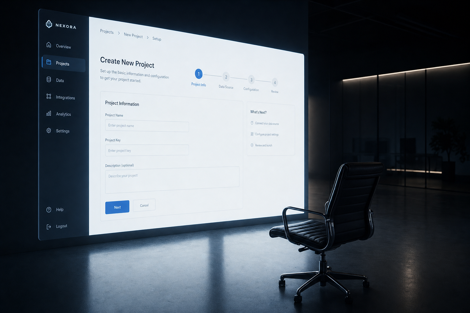
The Progressive Disclosure Trap
For a few years, "progressive disclosure" was the answer to overwhelming new users. Hide advanced features. Surface them only after the user has completed earlier steps. Walk them through the product in a controlled sequence.
The logic made sense in 2020. Users were getting dropped into complex tools with no context. Tutorials helped.
By 2024, something shifted. Products had more competition. Users had less patience. And progressive disclosure, which was designed to reduce overwhelm, started to delay the moment users found the feature they actually came for.
We saw this directly in the RepurposeOne build. Early onboarding required users to complete a content profile before they could repurpose a single piece of content. The intent was good: collect context so the AI output would be relevant from the start.
Activation data told a different story. A significant share of users dropped off at that profile step. They had come to repurpose content. We were asking them to do homework first. When we moved the core action to the first screen and made the profile optional, completion of the first repurpose task increased sharply within the first session.
The product hadn't changed. The order of events had.
What Strong Activation Actually Looks Like
The products with the best week-one retention in our analysis shared a specific structure.
They identified the single action most correlated with long-term retention, the action that, once completed, meant a user was likely to come back. Then they built the entire first session around getting the user to that action as fast as possible.
Help was available, but it was contextual. It appeared when a user paused, backtracked, or hit a field that typically caused confusion. It did not appear before the user had a chance to try.
This is close to how Figma approaches new users. You open a file and you can start working. The tool does not explain itself before you touch it. You learn because you are doing, and contextual prompts appear when your behavior suggests you need them.
That structure is not accidental. It is a deliberate product decision that prioritizes felt value over taught value.
The Test You Can Run Today
Open your product in an incognito window. Treat yourself as a brand new user who has never seen it before.
Count the number of screens, steps, or prompts you encounter before you do the thing the product is actually for. Not configure. Not read. Do.
If that number is more than two, you have identified your activation problem. The fix is not better copywriting on your tooltips. The fix is removing everything between the front door and the first real action.
Then ask one more question: when a user completes that first action, do they feel something? Do they see a result that makes the product's value obvious without explanation?
If the answer is no, that is your product design problem, and it is worth fixing before you spend another dollar on acquisition.
Onboarding that teaches before it delivers is not cautious. It is expensive. Every user who churns in week one paid attention you cannot buy back.